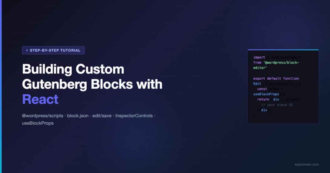
Building a custom Gutenberg block from scratch is one of the most valuable skills a WordPress developer can add to their toolkit in 2026. The block editor has matured into a powerful platform, and understanding how to extend it with React gives you complete control over the editing experience. This tutorial walks you through every step — from scaffolding your project with @wordpress/scripts to wiring up InspectorControls, attributes, and both the edit and save components — so you finish with a fully functional, production-ready block.
Whether you are building a custom call-to-action block, a testimonial card, or a complex data-display component, the foundation is identical. Master it once and the pattern applies everywhere.
What You Will Build
By the end of this tutorial you will have a working Highlight Card block — a block that accepts a heading, body text, a background color picker, and a link URL. It uses useBlockProps, InspectorControls, RichText, and the PanelColorSettings component from the WordPress block editor package. All the concepts that apply to this block apply to any block you build next.
Prerequisites
- Node.js 18+ and npm installed locally
- A local WordPress install (Local by Flywheel, DevKinsta, or Docker)
- Basic familiarity with React (props, hooks, JSX)
- Working knowledge of WordPress plugin structure
Step 1: Scaffold Your Block Plugin with @wordpress/scripts
The @wordpress/scripts package is the official build toolchain for Gutenberg block development. It wraps webpack with sensible defaults so you never have to touch a webpack config. Start by creating a plugin directory in your WordPress installation’s wp-content/plugins folder, then initialise a Node project inside it.
The --save-dev flag keeps @wordpress/scripts as a development dependency because it is only needed during the build process, not at runtime on the server. After install, open package.json and verify the scripts section contains the build and start commands.
The start script runs webpack in watch mode — every save triggers an incremental rebuild in milliseconds. The build script produces minified production assets. You will use start during development and build before deployment.
Step 2: Create the block.json Manifest
Every Gutenberg block is described by a block.json manifest file. This JSON file is the single source of truth for the block’s name, title, category, icon, attributes, and asset paths. WordPress reads this file to register the block on both the server and the client. Keeping configuration here — rather than scattering it across PHP and JS — is the modern, recommended approach.
Create src/block.json in your plugin:
A few things to note about this manifest. The name field follows the namespace/block-name convention — use your plugin or company slug as the namespace to avoid collisions with core or third-party blocks. The attributes object defines the block’s data schema: each attribute has a type and optionally a default. WordPress serialises these attributes into the block comment in the post content, which is how saved data persists across sessions. The editorScript, editorStyle, and style keys point to the compiled asset files that @wordpress/scripts will generate inside the build/ directory — you do not need to enqueue them manually when using register_block_type with the path to block.json.
Step 3: Register the Block in PHP
The PHP side of block registration is intentionally minimal when you use block.json. One call to register_block_type with the path to the build/ directory handles everything — enqueueing editor scripts, editor styles, and front-end styles automatically.
This is the entire PHP file needed for a static block. If your block renders dynamic content — pulling data from a custom post type or REST API — you would add a render_callback argument here. For this tutorial the block is static: its output is determined entirely by the saved attributes, so no server-side render callback is needed.
Passing the
build/directory path toregister_block_typerather than individual file handles is the key change introduced in WordPress 5.8. It readsblock.jsonautomatically and wires up every asset declared in it.
Step 4: Write the Edit Component
The edit component is what users see and interact with inside the Gutenberg editor. It receives a props object containing attributes (the current saved values), setAttributes (a function to update them), and several other helpers. You destructure what you need and build a React component around it.
The useBlockProps hook is mandatory — it injects the class names, data attributes, and event handlers that Gutenberg needs to manage block selection, focus, and toolbar positioning. Never omit it.
Walk through what is happening here. The RichText component renders an inline contenteditable element. It accepts an onChange callback that receives the new HTML string and calls setAttributes to persist it. The value prop keeps it controlled. The tagName prop tells RichText which HTML element to render — h3 for the heading and p for the body text.
The inline style on the wrapper div wires the backgroundColor attribute directly to the component’s appearance, giving editors immediate visual feedback as they pick colors in the sidebar panel.
Step 5: Add InspectorControls for the Sidebar Panel
InspectorControls is a portal component that renders its children into the block inspector panel (the right-hand sidebar that appears when a block is selected). This is where you place settings that do not belong inline with the content — colors, layout options, URL inputs, toggle switches, and anything else that would clutter the content canvas.
The edit component above already includes InspectorControls wrapping a PanelColorSettings. Here is a closer look at expanding that panel to also include a URL text control:
The PanelBody component creates a collapsible section in the sidebar. initialOpen={true} means it starts expanded. Nesting TextControl inside gives editors a plain text input for the link URL. The onChange handler calls setAttributes({ linkUrl: value }) to keep the block’s state in sync.
Notice that InspectorControls is placed as a sibling of the block content, not a wrapper around it. This is intentional — React portals teleport the inspector markup to the sidebar without affecting the DOM hierarchy of the block itself.
Step 6: Write the Save Component
The save component defines the static HTML that Gutenberg serialises into post_content. It receives the same attributes object as the edit component but does not receive setAttributes — save is a pure function of attributes to HTML.
This is one of the most misunderstood aspects of block development: the save output must be deterministic. Given the same attributes, save must always return exactly the same HTML. If you change the save function after a block is already saved in posts, WordPress will show a “Block validation failed” error because the stored markup no longer matches what the current save function would produce. Migrations and deprecated block versions handle this — covered in the advanced section below.
The RichText.Content component is the save-side counterpart to RichText. It renders the stored HTML value without the contenteditable interface. Always use RichText.Content in save — never use a plain p or h3 with a raw attribute value, because that bypasses WordPress’s HTML sanitisation pipeline.
Step 7: Wire Up Attributes Correctly
Attributes are the heart of how Gutenberg persists block data. Understanding the three storage strategies WordPress supports will save you significant debugging time.
Attribute Sources
| Source | How it works | Best for |
|---|---|---|
attribute | Read from an HTML attribute of a selector | URLs, IDs, class names |
html | Read inner HTML of a selector | Rich text fields |
text | Read text content of a selector | Plain-text labels |
| none (serialised) | Stored in block comment as JSON | Settings, colors, numbers |
When you do not specify a source for an attribute, WordPress serialises its value into the block delimiter comment in the post content. This looks like <!-- wp:my-plugin/highlight-card {"backgroundColor":"#fff3cd"} /--> in the raw post. This approach is simple and reliable for non-HTML values like colors, numbers, and booleans.
When you specify "source": "html" with a "selector", WordPress parses the saved HTML to extract the attribute value. This means the value lives in the rendered HTML rather than the block comment, making it accessible to server-side rendering and search indexing without any JavaScript.
Step 8: Build and Test in the Editor
With all files in place, run the build watcher and activate the plugin in WordPress admin.
Activate the plugin at Plugins > Installed Plugins. Open a new post in the block editor, click the block inserter (the + button), and search for “Highlight Card”. Insert the block and verify you can type in the heading and body fields. Click the block to open the inspector — the Color Settings and Link URL fields should appear in the right sidebar.
Save the post as a draft. Switch to the Code Editor view (via the three-dot menu in the toolbar) to inspect the raw block markup. You should see your block’s serialised attributes inside the block delimiter comment alongside the rendered HTML output from the save component.
Step 9: Add Block Styles and a Front-End Stylesheet
The style key in block.json points to a stylesheet that loads on both the editor and the front end. This is where you put the base visual styles for your block. The editorStyle key loads an additional stylesheet only in the editor — useful for hiding resize handles, adding selection highlights, or any editor-only UI chrome that should not appear on the published page.
Create src/style.scss:
@wordpress/scripts compiles SCSS automatically — no additional configuration needed. The compiled build/style-index.css file is what WordPress enqueues via the style reference in block.json.
Step 10: Handle Block Deprecations
The moment you publish a block and it is saved in real posts, the save function is locked in. Any change to the save output — even adding a CSS class — will trigger block validation errors for existing posts. The solution is block deprecations: an array of previous save function versions that WordPress uses to migrate old content.
WordPress walks the deprecated array from first to last, trying each save function against the stored markup. When one matches, it runs the corresponding migrate function to transform the old attributes to the new schema, then re-saves using the current save function. This process is transparent to the editor user — they just see the block loading normally.
Always add a deprecation entry before shipping any save function change. This is non-negotiable for blocks already in production posts.
Step 11: Use Block Variations for Multiple Presets
Block variations let you offer multiple pre-configured versions of the same block from the inserter. Instead of creating separate blocks for a “Warning Card” and a “Success Card” when the underlying structure is identical, register variations with different default attributes.
Each variation appears as a separate option in the block inserter with its own title, description, and icon. When the editor inserts a variation, the block initialises with the attributes defined in the variation’s attributes object. This pattern dramatically reduces the number of block registrations you need to maintain for similar UI components.
Step 12: Add Block Transforms
Block transforms allow editors to convert your custom block from and to other blocks. Adding a transform from the core Paragraph block, for example, lets editors select a paragraph and convert it to your Highlight Card with one click — preserving the text content.
The from array defines incoming transforms (what blocks can be converted into your block). The to array defines outgoing transforms (what your block can become). The transform callback function receives the source block’s attributes and returns the new block created by createBlock. Map the relevant data fields so editors do not lose their content during the conversion.
Complete File Structure
Here is the full directory layout for the finished plugin:
The src/ directory contains all source files. The build/ directory is generated by @wordpress/scripts and should be committed to version control (unlike node_modules, which should be in .gitignore). The build/ directory is what WordPress reads at runtime.
Common Mistakes and How to Avoid Them
Forgetting useBlockProps
The most common beginner mistake is omitting useBlockProps() from the edit component’s root element. Without it, the block appears to work but critical editor features break: you cannot click to select the block, toolbar positioning is wrong, and drag-and-drop fails. Always spread useBlockProps() onto the outermost element in both edit and save.
Mutating Attributes Directly
Never mutate the attributes object directly. Always use setAttributes({ key: value }). Direct mutation bypasses Gutenberg’s state management, which means the change will not be persisted, the undo stack will not be updated, and re-renders will not fire correctly.
Mismatched Edit and Save Output
The save component is a pure serialisation function. If you conditionally render elements based on JavaScript state (not attributes), the save output will differ from the edit output, causing validation failures. Every piece of data that influences the save output must come from attributes — nothing else.
Block Comment Syntax in Text Content
Never include raw block delimiter syntax inside paragraph or heading text. The Gutenberg block parser scans all post content for block delimiters. Writing the literal string <!– wp:anything –> inside a text node causes the parser to treat it as a block boundary, breaking the surrounding paragraph and leaving unclosed tags that corrupt everything after it. Use HTML entities (<!– wp:anything –>) when you need to display this syntax as text.
Performance Tips for Production Blocks
- Use
@wordpress/dataselectors sparingly in edit — everyuseSelectsubscription re-renders the block on any store change. Narrow selectors to the exact data you need. - Memoize expensive computations — wrap attribute-derived calculations in
useMemoto prevent recalculation on every keystroke in other blocks. - Lazy-load heavy editor components — if your block’s inspector panel uses a complex color picker or media library component, import it with dynamic
import()so it only loads when the panel is opened. - Avoid network calls in edit — if you need server data (post meta, REST API), use the
useSelecthook with thecoreorcore/editorstore rather than rawfetchcalls. The store handles caching and deduplication automatically. - Keep save lean — the save function runs every time the block re-renders during editing. A slow save function blocks the editor’s main thread. Move any data transformation logic into edit or into selectors, not into save.
Testing Your Block
The @wordpress/scripts package ships with a Jest configuration for unit testing block components. Install the testing utilities and create a test file alongside your block:
Run tests with npm test. The serialize function from @wordpress/blocks is particularly useful for snapshot testing the save output — create a snapshot once, and subsequent test runs will catch any unintentional changes to the serialised HTML before they reach production.
Next Steps
You now have a solid foundation for custom Gutenberg block development with React. The patterns here — block.json manifests, edit/save split, useBlockProps, InspectorControls, attributes, deprecations, variations, and transforms — are the building blocks of every Gutenberg integration, from simple content blocks to full page-builder systems.
From here, explore dynamic blocks (server-side rendering via render_callback), inner blocks (InnerBlocks for nesting), and the @wordpress/block-library source code to see how core blocks implement these patterns at scale. The The Ultimate WordPress Menu Customization Guide: Dropdowns, Icons, and Mega Menus and the WordPress Block Editor Handbook is the canonical reference for anything not covered in this tutorial.
The edit/save split is what makes Gutenberg blocks portable and version-controlled. Every attribute is explicit, every render is deterministic, and every migration is trackable. This discipline is what separates maintainable blocks from brittle ones.
Start Building Today
Clone the completed plugin from the GitHub Gist links embedded throughout this tutorial, install dependencies with npm install, and run npm start. Your first custom Gutenberg block will be live in the editor in under five minutes. From there, the entire WordPress block ecosystem is yours to extend.
Have questions about a specific block pattern or a use case not covered here? Drop it in the comments and the WP Pioneer community will weigh in.
@wordpress/scripts Block Development Gutenberg React WordPress Blocks
Last modified: April 10, 2026


")