WordPress Mobile Optimization: The Essential Guide to Fast, Responsive Sites

Having a responsive theme is the starting point, not the finish line. “Responsive” means your layout reflows on small screens. “Mobile-friendly” means the experience is actually good: fast load times, touch targets people can tap without zooming in, readable text without pinching, menus that don’t obscure content. These are different problems, and most WordPress sites solve the first one while ignoring the rest.
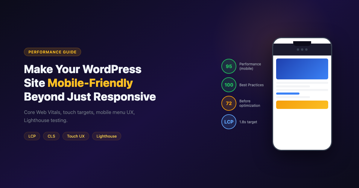
This guide covers the specific optimizations that move a responsive site to a genuinely mobile-friendly one, with data from Core Web Vitals, Lighthouse testing, and what Google actually measures in its mobile-first indexing signals.
Why Mobile-First Indexing Changed Everything
Google switched to mobile-first indexing for all sites in 2023. This means Google’s crawler primarily uses the mobile version of your site to determine rankings for everyone, including desktop users. A site that looks great on desktop but is slow or hard to use on mobile will rank below a site that works well on mobile, even for desktop search queries.
Core Web Vitals are the technical metrics Google uses to assess page experience. They’re measured separately for mobile and desktop, and the mobile scores are what matters most:
| Metric | Measures | Good threshold | Common WordPress culprit |
|---|---|---|---|
| LCP (Largest Contentful Paint) | Loading speed | Under 2.5 seconds | Unoptimized hero images, slow hosting |
| INP (Interaction to Next Paint) | Responsiveness to taps/clicks | Under 200ms | Heavy JavaScript blocking the main thread |
| CLS (Cumulative Layout Shift) | Visual stability | Under 0.1 | Images without width/height, ads loading late |
Step 1: Test Your Current Mobile Experience
Before fixing anything, measure where you are. Three tools cover different angles:
Google PageSpeed Insights
Go to pagespeed.web.dev, paste your URL, and check the mobile tab. This shows your Core Web Vitals from real Chrome users (field data) plus a simulated test (lab data). The field data is what affects rankings.
Chrome DevTools Mobile Simulation
In Chrome, open DevTools (F12 or Cmd+Option+I), click the device icon to enable mobile simulation, and pick a device (Pixel 7 or iPhone 14 are good representatives). Browse your site. This simulates a touchscreen viewport but uses your desktop network speed. Use the Network tab’s throttling to simulate 4G mobile speed.
Test on a Real Phone
Simulation doesn’t replicate everything. Use a real Android or iOS device. Log into your site, navigate through a few posts, try tapping small elements, and submit a contact form. Real-device testing catches touch target problems and mobile-specific CSS rendering issues that emulators miss.
Step 2: Fix the Viewport Meta Tag
Your theme should already include this in the HTML head:
Verify it’s there by viewing your page source and searching for “viewport.” If it’s missing, your responsive CSS won’t work at all on mobile. In WordPress, this tag is added by most modern themes via wp_head().
Common mistake: some developers add user-scalable=no or maximum-scale=1 to prevent pinch-zoom. This is an accessibility violation (WCAG 2.1 criterion 1.4.4) and Google penalizes it in mobile usability reports. Users who need to zoom for readability should be able to.
Step 3: Fix Touch Target Sizes
Google’s mobile usability guidelines require interactive elements (links, buttons) to be at least 48×48 pixels, with 8 pixels of space between adjacent targets. Most WordPress themes fail this on navigation menus, social icon links, and read-more links.
To check: in PageSpeed Insights, the “Tap targets are not sized appropriately” audit lists every failing element with a screenshot of where it is.
Fix with CSS in your theme or Customizer:
Step 4: Optimize Images for Mobile LCP
Images are the number one cause of slow LCP on mobile. WordPress loads the same image that works on desktop to mobile visitors unless you implement responsive images correctly.
WordPress’s Built-In Responsive Images
WordPress automatically generates multiple image sizes when you upload and adds srcset attributes to <img> tags. This means the browser downloads a smaller image on mobile automatically, as long as:
- You insert images via the block editor (the Media block generates proper srcset)
- Your theme doesn’t force a specific image size via CSS that’s larger than the mobile image served
Improving LCP: The Hero Image
The hero image on your homepage or featured image on posts is usually your LCP element. Two specific changes help:
- Add fetchpriority=”high”: Tell the browser to load this image before anything else. In WordPress 6.3+, this is added automatically to the first image in the content. For theme images (hard-coded in header.php), add it manually.
- Preload the LCP image: Add a preload hint in your theme’s header. This makes the browser start downloading before it’s processed the CSS that references it.
Convert to WebP or AVIF
WebP images are 25-35% smaller than JPEG at equivalent quality. AVIF is another 20% smaller than WebP but has slightly less browser support. Plugins like Imagify, ShortPixel, or Smush convert and serve WebP automatically, replacing the src and srcset with the optimized format. This alone often drops LCP by 0.5-1 second on mobile.
Step 5: Prevent Layout Shift (CLS)
CLS above 0.1 means visible content is moving after the initial render. The most common causes on WordPress sites:
Images Without Explicit Dimensions
When the browser doesn’t know an image’s dimensions, it reserves no space for it. When the image loads, everything below it jumps down. Fix: always specify width and height attributes on img tags, or use CSS aspect-ratio:
The WordPress block editor automatically adds width and height to images you insert. For custom theme images, add these attributes manually.
Ads and Embeds Loading After Content
Google AdSense and other ad networks inject content after page load. Reserve the space in your layout with a min-height placeholder:
Web Fonts Causing Layout Shift
Custom fonts replace system fonts after download, shifting text. Add font-display: optional or font-display: swap to your @font-face declarations. optional is the best choice for CLS: if the font doesn’t load in 100ms, the browser uses the fallback and never swaps, eliminating the shift.
Step 6: Optimize the Mobile Navigation Menu
Mobile navigation is a usability problem most WordPress themes handle poorly. Common issues:
- Hamburger menu with no visible label: Many users don’t recognize the three-line icon as a menu. Add a “Menu” text label next to it.
- Menu overlays too much of the screen: A full-screen overlay menu that covers product content creates anxiety about how to close it. Use a slide-in drawer that shows 15-20% of the underlying content instead.
- No back button for nested menus: Deep navigation (3 levels) on mobile needs explicit back navigation, not just the parent item.
- Dropdown menus on hover: Hover doesn’t exist on touchscreens. Any navigation that relies on CSS :hover for dropdown menus will be inaccessible on mobile.
Accessible Mobile Menu Pattern
A well-built mobile menu uses a button element (not a div or anchor) to toggle visibility, uses aria-expanded to communicate state to screen readers, and traps focus within the open menu. The WordPress Navigation block handles most of this automatically. For custom theme menus, the pattern looks like:
The JavaScript for the toggle can be as simple as toggling an is-open class on the nav element and flipping aria-expanded on the button.
Step 7: Reduce JavaScript Load on Mobile
JavaScript is the most expensive asset per byte on mobile. The browser downloads, parses, and executes it, and none of this can happen in parallel on a single CPU core.
Defer Non-Critical Scripts
WP Rocket, LiteSpeed Cache, and Autoptimize can defer JavaScript loading until after page paint. Check that your contact forms and popup scripts work after deferral (some break if deferred).
Remove Unused Scripts
Many WordPress plugins load scripts on every page even when they’re not needed. Use Asset CleanUp or WP Rocket’s per-post exclusion to unload scripts on pages where they’re unused. Common offenders: WooCommerce cart scripts on non-shop pages, contact form scripts on pages with no form.
Measuring JavaScript Impact
In Chrome DevTools, open the Coverage tab (Cmd+Shift+P, type “Coverage”). Load your page and look at the percentage of each JavaScript file that’s actually used. Files where over 60% of code is unused are candidates for deferred loading or removal. This is especially useful for identifying bloated plugin scripts that load globally.
Step 8: Test With Google’s Mobile Usability Report
In Google Search Console, go to Experience > Mobile Usability. This report shows pages flagged for specific mobile issues:
- Text too small to read (font-size below 12px)
- Clickable elements too close together
- Content wider than screen (causes horizontal scrolling)
- Viewport not set
Fix any items in this report as a priority; they directly affect how Google ranks your pages for mobile search.
Fixing “Content Wider Than Screen”
Horizontal scrolling on mobile is caused by a fixed-width element that doesn’t reflow. Common causes: embedded iframes set to a fixed width, code blocks with overflow: visible, tables without horizontal scroll wrappers, and images with explicit pixel widths wider than the viewport.
The catch-all fix is to add overflow-x: hidden to your body, but this can hide legitimate content. Better to find and fix the specific element. In Chrome DevTools, open the mobile simulator and drag the viewport width until you see what’s overflowing. The Elements panel highlights the element causing the issue.
Typography: Readable Text on Mobile
Google flags text under 12px as too small to read. But “not flagged” isn’t the same as readable. For body text on mobile, 16px is the standard minimum. Line height at 1.5-1.6x the font size keeps paragraphs scannable. Paragraph width (measure) should be 60-75 characters on any screen size.
The clamp() function creates fluid type that scales with viewport width between a minimum and maximum size. This removes the need for multiple breakpoints for typography.
A score of 95+ on Lighthouse mobile is achievable for most WordPress sites. The gap between 65 and 95 is almost always images, JavaScript, and layout shift – not the theme itself.
Summary: Mobile Optimization Priority Order
- Run PageSpeed Insights on your most-visited post. Note LCP, INP, CLS scores.
- Convert images to WebP and add explicit dimensions.
- Fix tap target sizes on navigation and social links.
- Reserve space for ads and late-loading embeds.
- Test mobile navigation by tapping through your menu on a real device.
- Defer non-critical JavaScript.
- Check Mobile Usability report in GSC and fix any flagged items.
- Set fluid typography with clamp() to eliminate readability issues at all viewport widths.
Forms and Input Fields on Mobile
Contact forms and checkout fields deserve specific attention on mobile. The default keyboard type should match the expected input: use inputmode="email" on email fields to show the email keyboard, inputmode="numeric" on phone number fields to show the number pad, and inputmode="url" for URL fields. WordPress form plugins like WPForms and Gravity Forms set these automatically, but custom form HTML often doesn’t. Contact form mobile usability directly affects conversion rate, especially for lead generation sites.
Finally, set up a recurring reminder to test your mobile experience after every theme update or major plugin change. Mobile regressions are common after updates: a plugin that worked fine on the previous version may load JavaScript that blocks rendering on mobile, or a theme update might change CSS that breaks touch targets you previously fixed. A 10-minute mobile test after every update catches these issues before they appear in your Core Web Vitals data or Mobile Usability report.
Navigation is one of the most common mobile UX failures on WordPress sites. Our guide on how to add navigation menus that work correctly on mobile covers hamburger menu patterns, focus management, and accessibility requirements that apply to all mobile navigation implementations.