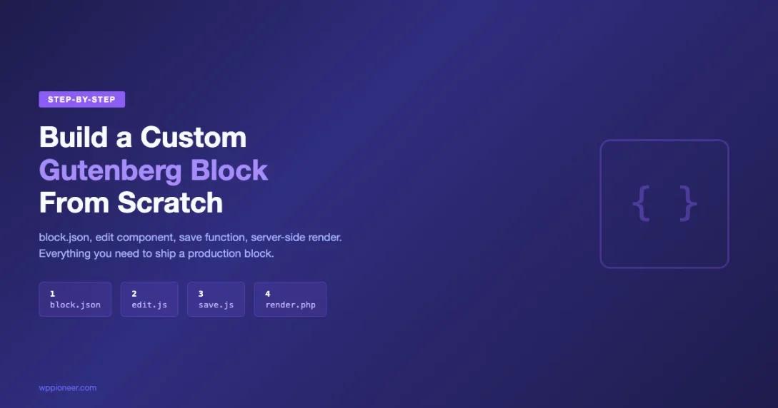
Building custom Gutenberg blocks is one of the most valuable skills a WordPress developer can learn today. The block editor has fundamentally changed how WordPress handles content, and knowing how to create your own blocks gives you complete control over the editing experience. In this tutorial, you will build a custom Gutenberg block from scratch, starting with zero setup and ending with a fully functional block that renders in both the editor and the front end.
What You Will Build
By the end of this tutorial, you will have a working “Info Card” block. This block displays a title, description, and a configurable background color, all controlled through the WordPress editor sidebar. Users can type directly into the block using rich text fields, pick colors from the sidebar panel, and see a live preview that matches the front-end output exactly.
The Info Card block covers the core concepts every custom block needs: attributes for data storage, edit.js for the editor interface, save.js for front-end rendering, InspectorControls for sidebar settings, the RichText component for inline editing, and custom styles for both the editor and the published page. Once you understand these pieces, you can build virtually any block.
Prerequisites and Tools You Need
Before writing a single line of block code, you need a working development environment. Gutenberg block development uses modern JavaScript tooling, so make sure you have the following installed on your machine.
- Node.js (version 18 or later) — Download from nodejs.org. Run
node -vin your terminal to check your version. - npm (version 9 or later) — Comes bundled with Node.js. Verify with
npm -v. - A local WordPress installation — Use Local, MAMP, DDEV, or wp-env. You need a running WordPress site where you can activate plugins.
- A code editor — VS Code is the most popular choice for block development. Install the ESLint and Prettier extensions for a smoother workflow.
- Basic familiarity with React concepts — Gutenberg blocks use React under the hood. You do not need to be a React expert, but understanding components, props, and state will help.
The official Block Editor Handbook recommends using @wordpress/env for a Docker-based local environment, but any local WordPress setup works fine for this tutorial.
Step 1: Scaffold Your Block Plugin with @wordpress/create-block
WordPress provides an official scaffolding tool called @wordpress/create-block that generates a complete block plugin with all the correct file structure, build configuration, and boilerplate code. This is the recommended starting point for any custom Gutenberg block tutorial, and it saves you from manually configuring webpack, Babel, and the dozens of @wordpress npm packages your block depends on.
Open your terminal, navigate to your WordPress installation’s wp-content/plugins/ directory, and run the following command:
cd /path/to/wordpress/wp-content/plugins/
npx @wordpress/create-block info-card-block
This command does several things automatically. It creates a new directory called info-card-block, installs all required npm dependencies (including @wordpress/scripts, @wordpress/blocks, @wordpress/block-editor, and more), generates the PHP plugin file, and sets up the build pipeline. The process takes a minute or two depending on your internet connection.
Once scaffolding completes, you will see a directory structure like this:
info-card-block/
├── build/                  # Compiled output (generated by npm run build)
├── node_modules/           # Dependencies
├── src/
│   ├── block.json          # Block metadata (the single source of truth)
│   ├── edit.js             # Editor component
│   ├── save.js             # Front-end render
│   ├── index.js            # Block registration entry point
│   ├── editor.scss         # Editor-only styles
│   └── style.scss          # Shared styles (editor + front end)
├── info-card-block.php     # Plugin bootstrap file
├── package.json
└── readme.txt
Activate the plugin in your WordPress admin under Plugins. You should see a new block called “Info Card Block” available in the block inserter when editing any post or page.
Understanding the PHP Bootstrap File
Open info-card-block.php. The scaffolded code is minimal because WordPress 5.8 and later support registering blocks entirely from the block.json metadata file. The PHP file simply calls register_block_type and points to the build directory:
<?php
/**
 * Plugin Name: Info Card Block
 * Description: A custom Gutenberg block for displaying info cards.
 * Version: 0.1.0
 * Requires at least: 6.1
 * Requires PHP: 7.0
 * Author: Your Name
 * License: GPL-2.0-or-later
 * Text Domain: info-card-block
 */

function info_card_block_init() {
    register_block_type( __DIR__ . '/build' );
}
add_action( 'init', 'info_card_block_init' );
That single register_block_type() call reads everything it needs from the compiled build/block.json file, including the block name, script handles, style handles, and editor assets. No manual wp_register_script or wp_enqueue_style calls are needed. This is the modern approach to WordPress block development, and it is documented in the Block Metadata reference.
Step 2: Configure block.json — Your Block’s Identity
The block.json file is the single source of truth for your block’s configuration. It defines the block name, title, category, icon, attributes, and which scripts and styles to load. Open src/block.json and replace the default content with this configuration for the Info Card block:
{
    "$schema": "https://schemas.wp.org/trunk/block.json",
    "apiVersion": 3,
    "name": "create-block/info-card",
    "version": "0.1.0",
    "title": "Info Card",
    "category": "design",
    "icon": "info-outline",
    "description": "A customizable info card with title, description, and background color.",
    "keywords": [ "card", "info", "callout", "box" ],
    "supports": {
        "html": false,
        "align": [ "wide", "full" ]
    },
    "attributes": {
        "title": {
            "type": "string",
            "source": "html",
            "selector": "h3"
        },
        "description": {
            "type": "string",
            "source": "html",
            "selector": "p"
        },
        "backgroundColor": {
            "type": "string",
            "default": "#f0f4f8"
        }
    },
    "textdomain": "info-card-block",
    "editorScript": "file:./index.js",
    "editorStyle": "file:./index.css",
    "style": "file:./style-index.css"
}
Let me walk through the key properties. The name field uses a namespace/block-name format and must be unique across all installed plugins. The apiVersion: 3 ensures you get the latest block API features available in WordPress 6.1 and later. The keywords array helps users find your block when searching in the inserter. The supports object configures which built-in WordPress features your block opts into, such as alignment options.
Attributes: How Blocks Store Data
The attributes object is where you define every piece of data your block stores. Each attribute has a type (string, number, boolean, array, object) and optionally a source that tells WordPress how to extract the value from the saved HTML. In our Info Card, the title attribute pulls its value from the h3 element using "source": "html", and the description attribute pulls from the p element. The backgroundColor attribute has no source because it is stored as a block comment delimiter, not in the rendered HTML.
This distinction matters. Attributes with source: "html" are parsed from the block’s saved markup every time WordPress loads the post. Attributes without a source are stored in the block’s comment delimiter (the <!-- wp:create-block/info-card {"backgroundColor":"#e8f5e9"} --> wrapper). Understanding this is essential for building blocks that survive content migrations and block validation.
Step 3: Build the Editor Interface (edit.js)
The edit.js file controls what users see and interact with inside the WordPress block editor. This is a React component that receives the block’s attributes and a setAttributes function for updating them. Replace the contents of src/edit.js with this code:
import { __ } from '@wordpress/i18n';
import {
    useBlockProps,
    RichText,
    InspectorControls,
} from '@wordpress/block-editor';
import { PanelBody, ColorPalette } from '@wordpress/components';
import './editor.scss';

export default function Edit( { attributes, setAttributes } ) {
    const { title, description, backgroundColor } = attributes;

    const blockProps = useBlockProps( {
        style: { backgroundColor },
    } );

    const colors = [
        { name: 'Light Blue', color: '#f0f4f8' },
        { name: 'Light Green', color: '#e8f5e9' },
        { name: 'Light Yellow', color: '#fff8e1' },
        { name: 'Light Purple', color: '#f3e5f5' },
        { name: 'Light Gray', color: '#f5f5f5' },
    ];

    return (
        <>
            <InspectorControls>
                <PanelBody
                    title={ __( 'Card Settings', 'info-card-block' ) }
                    initialOpen={ true }
                >
                    <ColorPalette
                        colors={ colors }
                        value={ backgroundColor }
                        onChange={ ( newColor ) =>
                            setAttributes( { backgroundColor: newColor } )
                        }
                    />
                </PanelBody>
            </InspectorControls>

            <div { ...blockProps }>
                <RichText
                    tagName="h3"
                    value={ title }
                    onChange={ ( newTitle ) =>
                        setAttributes( { title: newTitle } )
                    }
                    placeholder={ __(
                        'Card title...',
                        'info-card-block'
                    ) }
                />
                <RichText
                    tagName="p"
                    value={ description }
                    onChange={ ( newDesc ) =>
                        setAttributes( { description: newDesc } )
                    }
                    placeholder={ __(
                        'Card description...',
                        'info-card-block'
                    ) }
                />
            </div>
        </>
    );
}
Let me break down what each import and component does in this custom Gutenberg block tutorial.
useBlockProps: The Required Wrapper
Every block’s root element must use useBlockProps(). This hook injects the CSS classes, data attributes, and event handlers that WordPress needs to identify and manage your block in the editor. Without it, the block editor cannot select, move, or delete your block. You can pass additional props (like our inline style for the background color) and they will be merged with the WordPress-generated props.
RichText: Inline Content Editing
The RichText component from @wordpress/block-editor gives users a familiar rich-text editing experience directly inside the block. You specify the HTML tagName to render (h3 for the title, p for the description), bind it to an attribute via value, and update the attribute through the onChange callback. The placeholder prop shows ghost text when the field is empty, guiding users on what to type.
InspectorControls: The Sidebar Panel
InspectorControls renders its children in the block editor’s right sidebar (the Settings panel) when the block is selected. Inside it, PanelBody creates a collapsible section, and ColorPalette renders a color picker. When the user picks a color, the onChange callback fires setAttributes with the new value, and the block re-renders instantly with the updated background.
This sidebar pattern is the standard way to add block settings in Gutenberg. You can add text inputs, toggle switches, range sliders, dropdown selects, and more using components from the @wordpress/components package. The Components Reference lists every available component.
Step 4: Define the Front-End Output (save.js)
While edit.js controls the editor experience, save.js defines the HTML that gets stored in the database and rendered on the front end. Replace src/save.js with:
import { useBlockProps, RichText } from '@wordpress/block-editor';

export default function Save( { attributes } ) {
    const { title, description, backgroundColor } = attributes;

    const blockProps = useBlockProps.save( {
        style: { backgroundColor },
    } );

    return (
        <div { ...blockProps }>
            <RichText.Content tagName="h3" value={ title } />
            <RichText.Content tagName="p" value={ description } />
        </div>
    );
}
Notice three critical differences from the edit component. First, we use useBlockProps.save() instead of useBlockProps(). The .save() variant generates static attributes suitable for serialization rather than the dynamic event handlers needed in the editor. Second, we use RichText.Content instead of RichText. The .Content variant outputs static HTML without editing capabilities. Third, there are no onChange handlers or setAttributes calls because the save function is purely a rendering function with no interactivity.
The save function must be a pure function of attributes. If you change your save output without providing a deprecation handler, WordPress will show a “This block contains unexpected content” validation error for all existing instances of your block. Plan your save markup carefully before shipping to production.
This is one of the most common stumbling blocks for developers learning to create WordPress blocks. The save output is validated against what is stored in the database every time a post is loaded in the editor. Any mismatch triggers a validation error. The Block Deprecation API is how you handle save markup changes in future versions of your block.
Step 5: Add Styles for Editor and Front End
Gutenberg blocks use two separate stylesheets. The style.scss file loads on both the editor and the front end, ensuring visual consistency. The editor.scss file loads only in the editor and is used for editor-specific adjustments like placeholder styling or selection indicators.
Replace src/style.scss with the shared styles:
.wp-block-create-block-info-card {
    padding: 24px 32px;
    border-radius: 8px;
    border-left: 4px solid #2271b1;
    margin: 24px 0;

    h3 {
        margin: 0 0 12px 0;
        font-size: 1.25em;
        font-weight: 600;
        line-height: 1.4;
        color: #1e1e1e;
    }

    p {
        margin: 0;
        font-size: 1em;
        line-height: 1.7;
        color: #444;
    }
}
The CSS class .wp-block-create-block-info-card is automatically generated from your block’s name in block.json. WordPress converts the namespace and block name (create-block/info-card) into a CSS class by replacing the slash with a hyphen and prepending wp-block-. This class is applied automatically by useBlockProps, so you never need to add it manually.
Now add editor-specific styles in src/editor.scss:
.wp-block-create-block-info-card {
    // Dashed border in editor to indicate editability
    border: 1px dashed #ccc;

    // Style the RichText placeholder text
    [data-rich-text-placeholder] {
        opacity: 0.5;
        font-style: italic;
    }

    &.is-selected {
        border-color: #2271b1;
    }
}
These editor styles add a dashed border so users can see the block boundaries while editing, style the placeholder text to look like ghost text, and highlight the border in WordPress blue when the block is selected. None of these styles affect the front end.
Step 6: The Build Process
Your source files in src/ use JSX, ESNext syntax, and SCSS, which browsers cannot run directly. The @wordpress/scripts package (included by the scaffolding tool) handles the compilation. From your plugin directory, run these commands:
# One-time build (for production)
npm run build

# Development mode with file watching (rebuilds on every save)
npm run start
During development, always use npm run start. It watches your src/ files and rebuilds the build/ directory instantly whenever you save a change. The compiled output includes transpiled JavaScript (JSX converted to createElement calls, ESNext to ES5 where needed), compiled CSS (SCSS to CSS, with autoprefixer), source maps for debugging in the browser DevTools, and the copied block.json with resolved file paths.
| Command | Purpose | When to Use |
|---|---|---|
npm run build | Production build, minified | Before releasing your plugin |
npm run start | Dev build with watch mode | During active development |
npm run lint:js | Check JavaScript for issues | Before committing code |
npm run lint:css | Check SCSS/CSS for issues | Before committing code |
Step 7: Test Your Block in the Editor
With your plugin activated and npm run start running, open any post or page in the WordPress editor. Click the “+” block inserter button and search for “Info Card.” You should see your block listed under the Design category with the info-outline icon.
Insert the block and test the following functionality:
- Type a title — Click on the “Card title…” placeholder and type. The text should appear as an H3 heading inside the card.
- Type a description — Click the description area and type a paragraph. Rich text formatting (bold, italic, links) should work out of the box.
- Change the background color — Select the block, open the Settings sidebar (gear icon), and expand “Card Settings.” Pick a color from the palette. The block background should update instantly.
- Save and view the front end — Save the post and view it on the front end. The card should render with the same title, description, and background color.
- Re-open in the editor — Go back to the editor. Your content and settings should persist exactly as you left them, with no validation errors.
If you see a “This block contains unexpected content” error, it means the save output does not match what was stored. Double-check that your save.js output structure exactly matches the attribute sources defined in block.json.
Extending Your Block: Next-Level Techniques
The Info Card block covers the fundamentals, but real-world blocks often need more. Here are practical extensions you can add using the same patterns.
Adding a Toggle Switch for Border Visibility
Add a boolean attribute to block.json and a ToggleControl to the sidebar:
// In block.json attributes:
"showBorder": {
    "type": "boolean",
    "default": true
}

// In edit.js, add to InspectorControls:
import { PanelBody, ColorPalette, ToggleControl } from '@wordpress/components';

<ToggleControl
    label={ __( 'Show left border', 'info-card-block' ) }
    checked={ showBorder }
    onChange={ ( value ) => setAttributes( { showBorder: value } ) }
/>

// In both edit.js and save.js, conditionally apply the style:
style: {
    backgroundColor,
    borderLeft: showBorder ? '4px solid #2271b1' : 'none',
}
Using block.json “supports” for Built-In Features
WordPress provides dozens of built-in block features through the supports property. Instead of building your own spacing controls, color pickers, or typography settings, you can opt in to the ones WordPress already provides:
"supports": {
    "html": false,
    "align": [ "wide", "full" ],
    "color": {
        "background": true,
        "text": true,
        "gradients": true
    },
    "spacing": {
        "padding": true,
        "margin": true
    },
    "typography": {
        "fontSize": true,
        "lineHeight": true
    }
}
With these supports enabled, WordPress automatically adds color, spacing, and typography controls to the sidebar without you writing any additional JavaScript. The values are applied as inline styles on the block wrapper. The Block Supports reference documents every available option.
Dynamic Blocks with PHP Rendering
Sometimes you need server-side rendering, for example, when your block displays dynamic data like recent posts, user profiles, or data from custom tables. In that case, you skip the save.js function (return null) and add a render_callback or render property in block.json:
// In block.json:
"render": "file:./render.php"

// In src/render.php:
<?php
$background = $attributes['backgroundColor'] ?? '#f0f4f8';
$title = $attributes['title'] ?? '';
$description = $attributes['description'] ?? '';
?>
<div <?php echo get_block_wrapper_attributes( array(
    'style' => 'background-color:' . esc_attr( $background ),
) ); ?>>
    <h3><?php echo wp_kses_post( $title ); ?></h3>
    <p><?php echo wp_kses_post( $description ); ?></p>
</div>
Dynamic rendering is documented in the Creating Dynamic Blocks guide. For our Info Card, static save rendering is fine, but knowing the dynamic approach prepares you for more advanced use cases.
Debugging Common Issues
Block development has a few gotchas that trip up even experienced developers. Here are the most common issues and their solutions based on real-world Gutenberg block development experience.
- “This block contains unexpected content” error — Your save output changed. Either revert the change, or add a deprecation to migrate old content.
- Changes not appearing in the editor — Make sure
npm run startis running. Check the terminal for compilation errors. Try a hard refresh (Ctrl+Shift+R) to clear the browser cache. - Styles not loading — Verify the file paths in
block.jsonpoint to the correct compiled files inbuild/. The paths should start withfile:./. - Block not showing in inserter — Check that the plugin is activated. Look for PHP errors in
wp-content/debug.log. Verifyblock.jsonhas valid JSON (no trailing commas). - Attributes not saving — Check that the
sourceandselectorin block.json match the actual HTML structure insave.js. If the attribute usessource: "html"withselector: "h3", the save function must render anh3element with that content.
Enable SCRIPT_DEBUG in your wp-config.php to load unminified versions of WordPress scripts, which makes debugging much easier:
define( 'SCRIPT_DEBUG', true );
define( 'WP_DEBUG', true );
define( 'WP_DEBUG_LOG', true );
Essential Resources for Gutenberg Block Development
The WordPress block editor ecosystem is large and actively evolving. These resources will help you go deeper as you build more complex blocks.
- Block Editor Handbook — The official documentation covering every API, component, and pattern. Start here for any question about Gutenberg block development.
- Block API Reference — Detailed documentation for block.json properties, attributes, supports, transforms, and more.
- WordPress Packages Reference — Documentation for every
@wordpress/*npm package, including@wordpress/components,@wordpress/data, and@wordpress/block-editor. - Gutenberg GitHub Repository — The source code for all core blocks. Reading how core blocks like
core/quote,core/table, orcore/coverare built is one of the best learning resources available. - Block Tutorial (Official) — A step-by-step walkthrough from the WordPress developer documentation that covers the basics from a different angle.
Summary and Next Steps
You have now built a custom Gutenberg block from scratch. The Info Card block you created demonstrates the foundational patterns that every WordPress block uses: block.json for metadata and attributes, edit.js for the editor interface with RichText and InspectorControls, save.js for the serialized front-end output, and separate SCSS files for editor and shared styles.
The key concepts to remember from this custom Gutenberg block tutorial are: always use @wordpress/create-block to scaffold new blocks, define your data model in block.json attributes before writing any JavaScript, use useBlockProps on every block’s root element, match your save.js structure to your attribute sources exactly, and leverage the built-in supports system before building custom controls.
From here, you can expand your block with features like inner blocks (allowing nested block content), block transforms (converting between block types), block variations (pre-configured presets of the same block), and the @wordpress/data store for accessing editor state. Each of these builds on the same React component and block.json patterns you have already learned.
The WordPress block editor will continue to grow in capability, especially with the ongoing Full Site Editing initiative. Investing time in learning Gutenberg block development today positions you to build themes, plugins, and client projects that take full advantage of where WordPress is heading.
Block Editor create-block Gutenberg Blocks WordPress Development
Last modified: April 2, 2026