WordPress Global Styles: The Complete Beginner’s Guide

You do not need to write a single line of code to change how your WordPress site looks. WordPress ships with a built-in tool called Global Styles that lets you control fonts, colors, spacing, and layout for your entire site from one place. In this guide you will learn exactly how to use it, step by step, even if you have never touched a website’s settings before.
What Are Global Styles in WordPress?
Global Styles is a panel inside the WordPress Site Editor. It is the control center for your site’s design. Think of it as a single master settings page where changes you make automatically apply everywhere – your homepage, blog posts, contact page, and every other page on your site.
Before Global Styles existed, you had to visit each page individually to change how text or colors looked, or pay a developer to write custom CSS. Now WordPress handles all of that through a visual interface anyone can use.
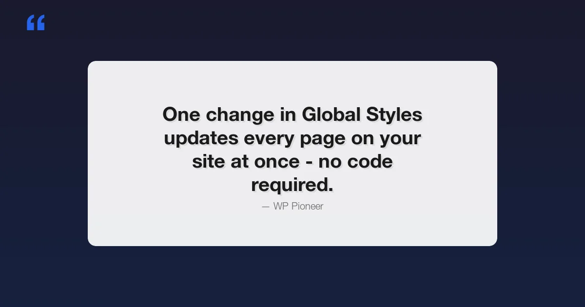
One change in Global Styles updates every page on your site at once. No code. No developer. Just a few clicks.
Global Styles works with block themes – themes built for the modern WordPress editor. Most themes released after 2022 support it. If you are using a classic theme (like many older free themes), you may not see the Global Styles panel. Check with your theme’s documentation if you are unsure.
How to Access Global Styles
Here is how to get there:
- Log in to your WordPress dashboard
- In the left menu, go to Appearance
- Click Editor
- You are now in the Site Editor
- Look for the Styles option in the left sidebar, or click the half-black half-white circle icon in the top right corner of the editor
That circle icon is your shortcut to Global Styles. Click it and a panel opens on the right side of the screen. This panel is where all your design controls live.
You will see three main sections at the top: Typography, Colors, and Layout. Below that is a list of every block type on your site (headings, buttons, images, and so on) where you can set styles for each one individually. We will cover all of these.
Typography – Changing Fonts and Text Sizes
Typography controls how text looks across your site. In Global Styles, click Typography to expand the section. You will see options for:
- Font family – the typeface (like Arial, Georgia, or Playfair Display)
- Font size – how big the text appears
- Line height – the space between lines of text
- Letter spacing – the gap between individual letters
- Font weight – how bold or thin the text is
Practical Example: Changing Your Heading Font to Playfair Display
Let’s say you want your headings to look more elegant. Playfair Display is a classic serif font that works well for blogs and lifestyle sites. Here is how to set it:
- In the Global Styles panel, click Typography
- Look for the Elements section and click Heading
- Under Font family, click the dropdown
- Search for “Playfair Display” or scroll to find it
- Click it to select
- Click Save in the top right corner
Your headings on every page now use Playfair Display. Notice how you did not have to go to each page – the change applied everywhere automatically.
You can set a different font for your body text (paragraphs) and a separate one for headings. Many designers pair a serif font for headings with a clean sans-serif font (like Inter or Open Sans) for body text. This combination is easy to read and looks professional.
Understanding Font Size Scales
WordPress uses a font size scale with names like Small, Medium, Large, X-Large, and XX-Large. When you change the Large size in Global Styles, every piece of text set to “Large” across your site updates. This is much faster than resizing text on each page one by one.
A safe starting point for body text is 16px or 18px. For headings, most sites use 28px to 48px depending on the level (H1 being the largest).
Colors – Setting Your Site’s Color Palette
The Colors section in Global Styles gives you control over:
- Background – the main background color of your site
- Text – the default color for all text
- Links – the color of clickable links
- Palette – a set of colors your theme uses throughout the design
- Gradients – blended color combinations for backgrounds and blocks
- Duotone – two-color filters applied to images
Practical Example: Setting a Site-Wide Accent Color
An accent color is the one color that stands out – usually used for buttons, links, and highlights. Here is how to change it:
- In Global Styles, click Colors
- Click Palette to see all the colors your theme uses
- Find the color labeled as your accent or primary color (it may say “Primary”, “Accent”, or just show a color swatch)
- Click that color swatch
- A color picker appears – type in a hex code (like
#e63946for a bold red) or drag the picker to your preferred shade - Click Save
Now your buttons, link text, and highlights all use that new color. If your theme uses the accent color in 20 places, all 20 places update at once.
Changing Background and Text Colors
Click Background to change the page background color. A white background is the most common choice for reading comfort. Dark backgrounds (like very dark navy or charcoal) work well for tech or creative sites but require you to also change your text color to something light.
If you change the background to dark, immediately go to Text and set it to white or a very light gray. Dark text on a dark background is nearly impossible to read and will drive visitors away.
What Is Duotone?
Duotone replaces all the colors in an image with just two colors – one for the dark areas and one for the light areas. It gives images a stylized, graphic-design look. You will see this effect on many modern marketing websites. In Global Styles you can define duotone presets that appear as filter options whenever you add an image block to your pages.
Layout – Controlling Width, Spacing, and Padding
Layout settings control how wide your content is and how much breathing room it has. Click Layout in the Global Styles panel to see:
- Content width – how wide your main content column is (in pixels)
- Wide width – how wide “wide” aligned blocks can stretch
- Padding – space on the left and right edges of your pages
- Block spacing – the default gap between blocks on every page
| Setting | What It Controls | Typical Value |
|---|---|---|
| Content Width | Width of text and standard blocks | 650px – 800px |
| Wide Width | Max width of wide-aligned blocks | 1200px – 1400px |
| Padding | Left and right edge space | 20px – 40px |
| Block Spacing | Gap between each block | 16px – 32px |
A content width around 680px to 750px is ideal for blog posts. Research on reading comfort shows that lines longer than about 75 characters become harder to follow. Keeping your content width modest means your paragraphs stay at a comfortable reading length on any screen size.
Wide width is used when you set a block’s alignment to “Wide”. This lets things like images and tables stretch beyond the text column without going completely full width. It is useful for comparison tables and banner images.
Block-Specific Styles – Customizing Individual Block Types
Below the top-level Typography, Colors, and Layout sections, you will find a Blocks section. This lists every block type that exists in WordPress – Paragraph, Heading, Image, Button, List, Quote, and many more.
Clicking any block type here lets you set styles for that block everywhere it appears. For example:
- Buttons – change the background color, text color, border radius (how rounded the corners are), and padding for all buttons on the site
- Headings – set different sizes or weights for H1 through H6
- Quotes – change the border color or style of blockquote blocks
- Links – control hover color and underline style for all links
- Images – set default border radius so all images get rounded corners automatically
- Visibility – some block themes also let you control which blocks are shown or hidden per page. Learn more about WordPress block visibility and how to hide blocks without deleting them
Example: Making All Buttons Rounded
Rounded buttons look modern and friendly. Here is how to apply that style to every button on your site:
- In Global Styles, scroll down to the Blocks section
- Click Button
- Look for Border settings
- Set the Border radius to something like 50px (fully rounded) or 8px (slightly rounded)
- Click Save
Every button across your site – contact form buttons, call-to-action buttons, navigation buttons – now has that rounded style.
Global Styles vs Per-Block Styles – What Is the Difference?
This is a question beginners often have, and it is worth taking a moment to understand.
Global Styles sets the default for every block of that type across your entire site. It is the baseline. If you set all paragraph text to 18px in Global Styles, every paragraph on every page starts at 18px.
Per-block styles are overrides you apply to a specific block on a specific page. If you want one particular paragraph to be larger or a different color, you select that block in the editor and change its settings in the right-hand panel. That change only affects that one block – it does not change the global default.
| Feature | Global Styles | Per-Block Styles |
|---|---|---|
| Where you set it | Appearance > Editor > Styles panel | Block settings panel (right sidebar in the editor) |
| What it affects | Every block of that type site-wide | Only that one specific block |
| Best for | Fonts, brand colors, general layout | One-off design choices on individual pages |
| Overrides | Is the default baseline | Overrides the global default for that block |
Think of Global Styles as the default setting on a thermostat. Everyone in the house starts at 70 degrees. Per-block styles are like someone in one room turning their own dial to 75 degrees – it only changes that room.
Saving and Reverting Changes
WordPress saves your Global Styles changes when you click the Save button in the top right corner of the Site Editor. Until you click Save, the changes are only in preview mode and have not been applied to your live site.
How to Preview Before Saving
You can click around your site within the editor to see how changes look on different pages before saving. The editor shows a live preview in the center area. Use the left sidebar to navigate to your homepage, a blog post, or any other page to check how your style changes look there.
How to Revert to the Theme’s Default Styles
Made changes and do not like them? WordPress keeps the original theme styles and you can go back at any time:
- Open the Global Styles panel (click the half-circle icon)
- Look for the three-dot menu (or a “Revisions” option) in the panel
- Click Revisions to see all past versions of your styles
- Select an older version to restore
Alternatively, if you want to go all the way back to the theme’s factory default:
- In the Global Styles panel, click the three-dot menu
- Select Reset to defaults
- Confirm the reset
This removes all your custom style overrides and restores whatever styles the theme originally shipped with. Your content (posts, pages, text) is not deleted – only the visual styling resets.
Style Variations – Switch Your Entire Look in One Click
Many modern block themes come with pre-built style variations. These are complete design presets – a full set of fonts, colors, and layout choices bundled together. Instead of changing one thing at a time, you pick a variation and your entire site design switches instantly.
To access style variations:
- Open the Global Styles panel
- Click Browse styles (or look for a grid icon showing multiple design options)
- Hover over each variation to preview it
- Click a variation to select it
- Click Save to apply
The Twenty Twenty-Five theme (WordPress’s default theme) ships with several style variations including a light version, a dark version, and variations with different font pairings. This is a great way to explore what your site could look like without manually adjusting every setting.
Common Beginner Mistakes to Avoid
Here are the most frequent issues beginners run into with Global Styles, and how to avoid them:
- Low contrast between text and background – Always check that your text color has enough contrast against the background. Light gray text on a white background is very hard to read. Use a contrast checker tool like WebAIM’s Contrast Checker (free, just search for it) to verify your choices meet basic accessibility standards.
- Using too many fonts – Stick to two font families maximum: one for headings, one for body text. More than two fonts makes a site look cluttered and unprofessional.
- Content width that is too wide – Setting content width to 1000px or more makes text lines very long and tiring to read. Keep it at 750px or below for comfortable reading.
- Forgetting to save – Global Styles changes are only previewed until you click Save. Many beginners close the browser and lose their work. Always click Save before leaving the editor.
- Changing per-block styles when you mean to change global styles – If you are editing a specific page and changing a block’s color there, that only affects that page. To change it everywhere, go back to Global Styles and set it at the global level.
Quick Reference: Where to Find Each Setting
| What You Want to Change | Where to Go in Global Styles |
|---|---|
| Font for all text on the site | Typography > Text |
| Font for all headings | Typography > Elements > Heading |
| Main text size | Typography > Font size |
| Site background color | Colors > Background |
| Default text color | Colors > Text |
| Link color | Colors > Links |
| Brand / accent color | Colors > Palette |
| Page content width | Layout > Content width |
| Side padding | Layout > Padding |
| Button styles | Blocks > Button |
| Heading sizes | Blocks > Heading |
| Quote block border | Blocks > Quote |
Does Global Styles Work With All Themes?
Global Styles works with block themes only. Block themes are built using a file called theme.json which defines the default styles. The Global Styles panel is your visual way to edit what’s in that file without touching code.
If your theme is a classic theme (older-style themes that use PHP template files), you will not see the full Global Styles panel. You may see a limited “Customize” option instead, which is the older way of changing theme settings.
To check if your theme supports Global Styles, go to Appearance > Editor. If the Site Editor loads with the full interface, your theme supports it. If you only see the old Customizer, your theme is a classic theme.
Popular block themes that fully support Global Styles include Twenty Twenty-Three, Twenty Twenty-Four, Twenty Twenty-Five (all free from wordpress.org), as well as many third-party themes. If you want the full Global Styles experience and are on an older theme, choosing the right WordPress theme is the first step – switching to one of the official default themes is a good starting point – they are free and well-maintained.
Frequently Asked Questions
Will changing Global Styles break my existing content?
No. Your posts, pages, images, and other content stay exactly as they are. Global Styles only changes how things look – colors, fonts, spacing. Your words and images are not affected.
Can I undo a Global Styles change?
Yes. Use the Revisions feature in the Global Styles panel to go back to any previous version. If you have not saved yet, simply close the browser tab and reopen the editor – your unsaved changes will be gone.
Do Global Styles affect my mobile site too?
Yes, the styles apply across all devices. WordPress uses responsive design, so your fonts, colors, and layout choices automatically adapt for mobile screens. Some layout values (like content width) may behave differently on small screens, but your color and font choices apply everywhere.
Can I use Google Fonts in Global Styles?
Yes, if your theme bundles Google Fonts or if you install a font plugin. Some themes include a selection of Google Fonts directly in the font family picker. You can also use a free plugin like “Fonts Plugin” or “Easy Google Fonts” to add more font choices to the Global Styles panel.
Next Steps After Setting Up Global Styles
Once you are happy with your Global Styles, here are a few things to do next:
- Check your site on mobile – Use your phone to browse your site and confirm everything looks good at small screen sizes
- Test your color contrast – Run your text and background colors through a free contrast checker to make sure all visitors can read your content comfortably
- Explore template parts – Your site’s header and footer also live in the Site Editor and can be customized to match your new styles
- Look at your category and archive pages – Make sure they also look correct with your new fonts and colors
- Ask a friend to look at your site – Fresh eyes often catch things you miss when you are deep in the settings
Want to Go Further With WordPress Design?
WP Pioneer covers beginner-friendly WordPress guides every week. If you found this helpful, explore our other step-by-step tutorials on the Site Editor, block patterns, and building pages without code. No experience required – just follow along and your site will look exactly the way you want it.