
Page builders are everywhere in WordPress. Elementor has over 10 million active installs. WPBakery ships bundled with thousands of premium themes. Divi has built an entire ecosystem around its visual editor. These tools are popular because they lower the barrier to entry for creating complex layouts.
But popularity does not mean they are the right choice for every site. Page builders add significant overhead: extra database rows per page, render-blocking JavaScript, and a dependency that can leave your content locked inside a proprietary format if you ever switch themes or tools.
The good news is that WordPress has had a capable block editor since 2018, and it has matured significantly. With Gutenberg and a well-chosen theme, you can build a clean, fast, professional landing page without installing a single page builder plugin. This guide walks you through the entire process.
Why Skip the Page Builder
Before diving into the how-to, it helps to understand what you are trading away and what you gain by going native.
Performance
A typical Elementor page loads 2-4 additional CSS files and at least one JavaScript bundle before the browser can render anything. On a modest shared hosting plan, this adds 300-800ms of render-blocking time. Google’s Core Web Vitals scoring penalizes Largest Contentful Paint (LCP) scores above 2.5 seconds, and a heavy page builder can easily push you over that threshold on a mobile connection.
Landing pages live or die by conversion rate, and page speed directly affects conversions. A 1-second delay in page load time reduces conversions by roughly 7% according to research from Cloudflare and Akamai. Going builder-free keeps your critical rendering path short. If you want to dig into WordPress performance more broadly, check our guide on how to speed up your WordPress site without hiring a developer.
Content Portability
When you build a page with Elementor or WPBakery, the content is stored as shortcodes or custom post meta, not as readable HTML. If you deactivate the plugin, those pages show raw shortcode text to visitors. Gutenberg stores content as HTML with comment-delimited block markup, which degrades gracefully. Even without Gutenberg active, a reader would still see the paragraph text.
Maintenance Overhead
Page builder plugins release frequent updates, and major version updates sometimes break existing layouts. When you have 40 landing pages built in Elementor and Elementor releases a breaking change, you face hours of testing and fixes. Native Gutenberg blocks are part of WordPress core. They update with WordPress itself, and WordPress maintains backward compatibility very carefully.
What You Need Before You Start
Building a landing page natively requires two things: a block-compatible theme and a clear understanding of which core blocks handle layout.
Choose the Right Theme
Not all themes work equally well with Gutenberg layouts. You need a theme that:
- Supports full-width and wide-width alignment for blocks
- Has minimal default content padding so your blocks control the layout
- Does not inject extra wrapper elements that fight your block styles
Good choices include Twenty Twenty-Four (the official WordPress FSE theme), GeneratePress (lightweight and block-friendly), Kadence, Blocksy, and Neve. All of these register proper alignment support and expose a clean canvas for Gutenberg layouts.
Full Site Editing (FSE) themes like Twenty Twenty-Four go one step further: they let you edit the page template itself from within the block editor, so you can remove the header and footer from a landing page entirely without touching PHP.
Enable Full-Width Templates
Classic (non-FSE) themes typically offer a “Full Width” or “No Sidebar” page template. When you create or edit a page, look in the right-hand sidebar under Template. Select the full-width option. This removes the sidebar and lets your content blocks use the full browser width.
If your theme does not offer a full-width template, you can add one. Create a file called page-landing.php in your (child) theme directory with the following contents:
<?php
/**
 * Template Name: Landing Page
 * Description: Full-width template with no header or footer.
 */
get_template_part( 'template-parts/content', 'page' );
Adjust get_template_part() to match your theme’s structure. Once saved, this template appears in the Template dropdown for any page you edit.
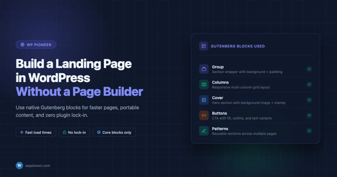
The Core Blocks You Will Use
A landing page typically needs a hero section, a features or benefits row, social proof, and a call-to-action. Here is how to build each section using only native Gutenberg blocks.
Group Block: Your Section Container
The Group block (/group in the inserter) is the equivalent of a <div> wrapper. Every major section of your landing page should live inside a Group block. This lets you set a background color, background image, padding, and margin for the entire section as a unit.
To add a Group block: click the + inserter, type “group”, and press Enter. Then add blocks inside it. In the block settings sidebar, use the Styles panel to set the background color, and use the Dimensions panel to add top and bottom padding.
Set the Group’s alignment to “Full Width” to make it span edge to edge. If your theme supports wide-width alignment, try “Wide Width” first to stay within a readable max-width.
Columns Block: Side-by-Side Layouts
The Columns block (/columns) creates a responsive multi-column grid. Choose from preset splits: 50/50, 30/70, 33/33/33, etc. Each column accepts any other block inside it.
Landing page uses for Columns:
- A hero section with text on the left and an image on the right
- A three-column feature row with an icon, heading, and description in each column
- A testimonials row with two or three side-by-side quote blocks
In the Columns block settings, you can set a vertical alignment (top, center, bottom) for the columns and control the gap between them. On mobile, columns stack vertically by default, so your layout is already responsive.
Cover Block: Hero Sections with Background Images
The Cover block (/cover) accepts a background image or video with overlaid text. This is the most direct way to build a full-width hero banner. Set a minimum height in pixels, choose a color overlay opacity, and add your headline and subheadline as nested Heading and Paragraph blocks.
A word on image optimization: if you use a Cover block with a large background image, run the image through a compression tool like Squoosh or ShortPixel before uploading. A 4MB hero image will destroy your LCP score regardless of how lean your page builder situation is.
Spacer Block: Breathing Room
The Spacer block (/spacer) adds a fixed amount of vertical space. Use it between sections to add visual separation without needing custom CSS. The default spacer is 100px; you can drag the handle or type a specific pixel value.
One tip: prefer using padding on Group blocks over Spacer blocks where you can. Padding is part of the section’s own box model, which makes the layout more predictable. Reserve Spacer for gaps between top-level sections.
Buttons Block: Calls to Action
The Buttons block (/buttons) renders one or more button links. You can set a primary and secondary button side by side. In the block settings, choose between filled, outlined, and text-only styles. Set the background color, text color, border-radius, and padding to match your brand.
For landing page CTAs, set the button to full-width on mobile using the Responsive controls in the block settings. A narrow button on a 390px screen is easy to miss.
Image and Media Text Blocks
The Media & Text block (/media-text) places an image alongside text content in a two-column layout. Unlike building this manually with the Columns block, Media & Text handles the image-to-text ratio and responsive stacking automatically. Use it for product screenshots, feature highlights, or any section where you want an image paired with explanatory copy.
Building the Landing Page: Step by Step
Here is a practical walkthrough for a typical lead-generation landing page. The goal: headline, hero image, three feature bullets, a testimonial, and a CTA form or button.
Step 1: Create a New Page and Set the Template
Go to Pages > Add New. Give the page a title. In the right-hand sidebar, under Page, click Template and choose your full-width or landing page template. If you are using an FSE theme, select “Blank” from the template list to remove header and footer.
Save the page as a draft. Do not publish until the entire layout is done.
Step 2: Build the Hero Section
Insert a Group block. Set alignment to Full Width. Open Styles and set a background color (your brand’s primary color, or a dark neutral). Set top and bottom padding to 80px.
Inside the Group, insert a Heading block (H1). Type your main headline. Align it center. Set text color to white. Below the heading, insert a Paragraph block with your subheadline. Keep it to one or two sentences. Then insert a Buttons block with your primary CTA: “Get Started”, “Download Now”, or whatever action you want visitors to take.
If you want a background image instead of a flat color in the hero, replace the Group with a Cover block. Set the background image, add a 50% dark overlay, and nest the heading, paragraph, and buttons inside it.
Step 3: Build the Features Row
Insert another Group block below the hero. Set a light background (white or off-white). Add 60px padding top and bottom.
Inside the Group, insert a Heading (H2) for the section title. Center-align it. Below the heading, insert a Columns block with three equal columns.
In each column:
- Add an Image block with a small icon (64x64px SVG or PNG)
- Add a Heading block (H3) with the feature name
- Add a Paragraph block with 2-3 sentences describing the benefit
If you want icons without uploading image files, install the Icon Block plugin by Nick Diego (it is in the official WordPress plugin repository and weighs under 20KB). It provides SVG icons from Heroicons and other open libraries directly inside the editor.
Step 4: Add Social Proof
A testimonial or quote section builds trust. Insert a Group block with a slightly different background (light gray works well). Inside it, use a Columns block with two or three columns. In each column, add a Quote block with the testimonial text and attribution.
Alternatively, use the Pullquote block for a single featured testimonial. The Pullquote block has built-in styling for larger display text and citation, and it looks polished without any custom CSS.
Step 5: The Call-to-Action Section
The bottom CTA is often the most important section. Insert a Group block with your brand’s accent color as background. Add a short Heading (H2), a one-line supporting paragraph, and a Buttons block.
If you need a lead capture form, install WPForms Lite or Contact Form 7 (both are free). Create the form in the plugin’s interface, then drop the Form block into your CTA Group and select the form. The Gutenberg Form block integration works natively with both plugins.
Reusable Blocks and Patterns
If you are building more than one landing page, Gutenberg’s reusable blocks and block patterns are a significant time-saver.
Reusable Blocks (Synced Patterns)
In WordPress 6.3 and later, “reusable blocks” were renamed to “synced patterns”. The concept is the same: you save a block or group of blocks as a named pattern, then insert it on multiple pages. Any edit to the pattern updates every instance.
To create one: select the block or blocks you want to save. Click the three-dot menu in the block toolbar. Select “Create pattern”. Give it a name, and check “Synced” if you want edits to propagate everywhere. Once saved, access it from the Patterns tab in the block inserter.
Good candidates for synced patterns: your header CTA strip, a “money-back guarantee” trust badge row, footer CTA, and any block of content that appears on multiple landing page variants.
Unsynced Patterns: Page Templates You Can Fork
An unsynced pattern is a starting point. You insert it, then edit the copy without affecting the original. This is the right choice for landing page layouts: create one complete landing page structure, save it as an unsynced pattern, and then fork it for each new campaign. Change the headline, swap the image, update the CTA, and you have a fresh page in minutes.
Customizing with Additional CSS
The block editor’s design tools cover a lot of ground, but sometimes you need adjustments that the UI does not expose. WordPress lets you add custom CSS in two ways.
Customizer Additional CSS
Go to Appearance > Customize > Additional CSS. Any CSS you enter here applies globally. This is where you would put overrides like removing the page title on landing pages, tweaking button border-radius, or adjusting the max-width of your content area.
/* Remove page title on pages with landing-page template */
.page-template-page-landing .entry-title {
    display: none;
}

/* Limit content width inside full-width groups */
.wp-block-group.alignfull .wp-block-group__inner-container {
    max-width: 1200px;
    margin-left: auto;
    margin-right: auto;
    padding-left: 2rem;
    padding-right: 2rem;
}
Per-Block Custom CSS Classes
Every block in Gutenberg has an “Advanced” panel in its settings sidebar with a CSS class field. Add a custom class here, then target it in your Additional CSS or child theme stylesheet. This keeps your CSS organized by component rather than cluttering the global stylesheet with overly specific selectors.
theme.json for FSE Themes
If you are using a Full Site Editing theme, the theme.json file controls default colors, font sizes, spacing, and layout settings. You can register custom color palettes and spacing presets that appear directly in the block editor toolbar, keeping your landing pages consistent with your brand without writing per-block CSS.
For example, to register a brand primary color and a custom spacing scale, add this to your child theme’s theme.json:
{
    "version": 3,
    "settings": {
        "color": {
            "palette": [
                { "name": "Brand Primary", "slug": "brand-primary", "color": "#0054a6" },
                { "name": "Brand Accent", "slug": "brand-accent", "color": "#f5a623" }
            ]
        },
        "spacing": {
            "spacingSizes": [
                { "name": "Small", "slug": "sm", "size": "1.5rem" },
                { "name": "Medium", "slug": "md", "size": "3rem" },
                { "name": "Large", "slug": "lg", "size": "6rem" }
            ]
        }
    }
}
When a Lightweight Block Plugin Makes Sense
“No page builder” does not mean “no additional blocks ever”. There is a meaningful difference between a 2MB page builder framework that rewrites the editor interface and a small blocks library that extends it.
Kadence Blocks
Kadence Blocks adds about 20 additional block types to Gutenberg: advanced buttons, info boxes, icon lists, count-up numbers, testimonials, and a row layout system. The plugin weighs around 500KB and loads only the CSS for blocks that are actually used on the page. It is a reasonable choice if you need components that core Gutenberg does not provide and you do not want to build them with raw HTML.
GenerateBlocks
GenerateBlocks takes a different approach: instead of providing many specialized blocks, it provides four composable primitives (Container, Grid, Headline, Button) with very granular CSS controls. Designers who understand CSS prefer GenerateBlocks because it gives precise control without forcing you into preset component shapes. It pairs especially well with the GeneratePress theme.
When NOT to Use Additional Block Plugins
If you can accomplish the layout with core blocks and a small amount of custom CSS, skip the plugin. Each additional plugin is a dependency, a potential security surface, and a source of update-related breakage. The rule of thumb: if you would use fewer than three blocks from a plugin, the plugin is probably not worth its overhead.
Common Mistakes to Avoid
Nesting Blocks Too Deeply
It is tempting to wrap everything in groups and sub-groups. But deeply nested blocks become hard to edit, and each nesting layer can multiply the amount of CSS you need to override. Try to keep your hierarchy to three levels: page > section (Group) > content blocks.
Forgetting Mobile
Gutenberg’s Columns block stacks on mobile automatically, but it does not automatically adjust font sizes, padding, or button widths. After you build your desktop layout, switch to the mobile view in the WordPress Customizer (or use your browser’s responsive design mode at 390px) and check every section. Common issues: hero text that overflows, buttons that are too small to tap, and columns that stack in the wrong order.
WordPress 6.4 and later added responsive spacing controls directly in the block editor. Look for the phone/tablet/desktop icons next to the padding and margin inputs. Use these to set smaller padding values for mobile without writing any CSS.
Leaving the Default Page Title Visible
Most themes render the page title above the content area. On a landing page, this duplicates your hero headline and looks unprofessional. Either use a template that hides the title, or add the CSS snippet from the Customizer section above to suppress it on landing page templates.
Using Too Many Font Variations
The block editor makes it easy to change font weight and size on individual blocks. Resist the urge. Consistent typography is a sign of professional design. Stick to two font sizes for body copy (regular and small), two for headings (H1/H2 vs H3), and one font family. If you need more design expressiveness, do it through spacing and color rather than type variety.
Skipping the Excerpt and SEO Meta
Even though landing pages are often not blog posts, they still appear in search results. Fill in the Page Excerpt field in the block editor sidebar. If you have Yoast SEO or RankMath installed, set the focus keyphrase, meta title, and meta description. A well-optimized landing page can rank for its target keyword and capture organic traffic alongside paid traffic.
Testing Before You Launch
Before setting your landing page live, run through this checklist:
- Preview on mobile at 390px width (iPhone 14 size). Check text overflow, button sizing, and column stacking.
- Run Google PageSpeed Insights on the page URL. Target LCP under 2.5 seconds and CLS under 0.1. If WordPress admin itself feels slow on your server, read our guide on why WordPress admin gets slow and how to fix it.
- Click every button and form link to confirm they go to the right destination.
- Check that the page title tag is set correctly (not just the on-page H1).
- Verify the page is not set to “noindex” in your SEO plugin if you want it to rank.
- Test the form submission if you have a lead capture form.
A Note on Full Site Editing Themes
If you are starting a new site rather than retrofitting an existing one, consider using a Full Site Editing (FSE) theme from the start. FSE themes let you edit the site header, footer, and page templates directly in the block editor. This means you can create a landing page template that removes the header and footer entirely, adds a custom navigation bar, and sets a unique layout, all without writing PHP.
Go to Appearance > Editor (or Appearance > Site Editor depending on your WordPress version). Under Templates, click Add New Template. Choose “Single Page”. WordPress creates a new block-based template. Edit it like any other page: add a custom header block, remove elements you do not want, and save. Any page that uses this template will render exactly as you designed it.
The Site Editor is more powerful than the classic Customizer for landing page work, but it has a steeper learning curve. If you are new to FSE, spend 20-30 minutes exploring the Twenty Twenty-Four theme’s template structure before building your first custom template.
Putting It All Together
Here is the complete picture for a builder-free WordPress landing page:
- Choose a block-friendly theme (Twenty Twenty-Four, GeneratePress, Kadence, Blocksy, or Neve)
- Create a full-width or blank page template for landing pages
- Build each section inside a Group block set to full-width alignment
- Use Columns for multi-column layouts, Cover for hero sections with background images, and Buttons for CTAs
- Save repeatable sections as synced patterns; save whole page layouts as unsynced patterns
- Use theme.json or Additional CSS for brand consistency
- Test on mobile at 390px before publishing
- Set SEO meta on every landing page
This approach gives you a page that loads fast, stores content in portable HTML, and requires zero plugin dependency for its layout. When your hosting gets faster, when WordPress updates, or when you switch themes, your landing page continues working.
Page builders solve a real problem: they make complex layouts accessible to people who do not know CSS. But if you are comfortable learning a handful of block settings, the native Gutenberg editor is a capable, fast, and dependency-free alternative that keeps your site lean and your content portable.
Keep Learning: WordPress Block Editing
Want to go deeper with the WordPress block editor? These related guides on WP Pioneer cover the skills that will take your Gutenberg layouts from functional to polished:
- How to use the WordPress Site Editor to customize your theme without code
- WordPress block patterns: how to create, save, and reuse custom layouts
- Speed up your WordPress site: the beginner’s guide to Core Web Vitals
Beginner WordPress Tips Block Editor Full Site Editing Page Load Time Plugin Comparison
Last modified: April 29, 2026


Beginner’s Guide • How-To Guides • Site Maintenance Basics
April 29, 2026 • Views: 0
How to Moderate WordPress Comments Without Checking Them Every Day