
You have been told to write alt text for your images. You have probably been told it matters for accessibility, that it is the right thing to do, and possibly that there are legal reasons. All of that is true, and for a lot of site owners it has still ended up somewhere near the bottom of the list.
Here is a different reason, and it arrived quietly in a piece of Google documentation this summer.
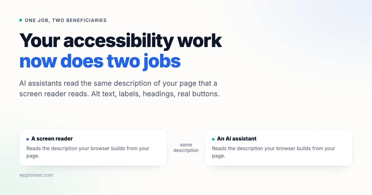
The same work that makes your site usable for someone using a screen reader is the work that makes your site usable by an AI assistant. Not similar work. The same work, reading the same information, for the same reason.
If you have been putting accessibility off, this is the sentence that might move it up your list.
What your site actually hands to software
When someone visits your site, their browser does something most people never think about. Alongside drawing the page, it builds a second, simpler description of it.
That description is a list of the meaningful things on the page and what each one is. This is a button, and it is called Add to basket. This is a heading, and it is the main one. This is a picture, and it shows a red kettle on a kitchen counter. This is a form field, and it wants your email address.
It is called the accessibility tree, and it exists because software that cannot see your page needs some way to understand it. A screen reader reads from it. That is how a blind visitor knows there is a button there, what it does, and whether it is available to press.
The important part for this article: your browser builds that description out of your page. If your page is vague, the description is vague. Nobody can fix it afterwards.
The thing that changed
AI assistants have started doing things on websites rather than just reading them. Booking, ordering, filling forms, completing a task somebody asked for in a chat window.
To do that, an assistant has the same problem a screen reader has. It cannot see your page. It needs a description it can work from.
Google has now built a tool that checks how ready a site is for this, and in explaining how it works they wrote a line worth quoting exactly:
Accessibility is for humans first. Agents rely on the accessibility tree, derived from DOM, as their primary data model.
Read past the jargon and it says this: the AI reads the same description your screen reader reads. There is no separate AI version of your site. There is one description, and both of them use it.
There is no separate AI version of your website. There is the accessible version, and there is the one nothing can use properly.
Note the first three words, because they matter and I do not want to oversell this. Accessibility is for humans first. Real people use screen readers today, and that was always reason enough. What is new is a second reason, arriving at a moment when the first one has failed to persuade a lot of people.
Five things that now do two jobs, and one that does not
None of this is new advice. What is new is that each item now has a second payoff.
1. Alt text that describes the picture
Alt text is the written description attached to an image. If the image does not load, it is what appears instead. If someone cannot see it, it is what gets read aloud.
Most alt text is bad in a specific way. It repeats the file name, or it stuffs in keywords, or it says something useless like “image” or “photo”.
Good alt text says what the picture shows, in the way you would describe it to someone on the phone. Not “kettle-red-2.jpg”. Not “red kettle buy online best price”. Just: a red enamel kettle on a wooden kitchen counter.
One exception worth knowing: if an image is purely decorative and adds nothing, it is better to mark it as decorative than to invent a description. WordPress lets you leave alt text empty for exactly this. A screen reader then skips it instead of reading out something pointless.
2. Link text that says where it goes
“Click here.” “Read more.” “Learn more.” “This page.”
Those are fine when you can see the sentence around them. They are useless on their own, and plenty of software encounters them on their own, because one common way to move through a page is to jump from link to link. A list of nine links all reading “read more” tells nobody anything.
Write the link text as the destination. “Read our refund policy” instead of “click here to read our refund policy”. It is shorter, it reads better, and it works when it is the only thing anyone sees.
3. Form fields with real labels
A label is the text attached to a field, telling you what belongs in it. It sounds obvious, and it goes wrong constantly, because of a design trend.
Somewhere along the way it became fashionable to delete the labels and put the words inside the boxes as grey placeholder text. It looks tidy. It creates two problems. The grey text disappears the moment someone starts typing, so anyone who forgets what a field was for has to delete their answer to check. And placeholder text is not a label, so software often does not treat it as one.
If your contact or checkout form has no visible labels above its fields, that is worth fixing. It is one of the few accessibility problems that also visibly annoys people who have no disability at all.
4. Headings in order
Headings are structure, not decoration. There is one main heading, then sections under it, then subsections under those.
The common mistake is choosing a heading level because of how big it looks. Someone wants smaller text, picks Heading 4, and the page now claims to have a sub-sub-subsection with nothing above it. To software reading the structure, that is a document with missing chapters.
Choose heading levels by what the section is, then change the size with your theme settings if you want it smaller. In the WordPress editor, the heading level and the appearance are separate choices.
5. Buttons that are really buttons
This one you cannot see, and it is the one most likely to break things.
On the web, a button can be a real button, or it can be a piece of the page styled to look like one. On screen they are identical. In the description your browser builds, the real one announces itself as a button with a name, and the fake one announces almost nothing.
You are not going to inspect your own markup, and you do not need to. There is a test anyone can run, and it is in the checklist further down: try to use the thing with the keyboard alone.
6. Enough contrast to actually read
This one is the exception in the list, because it helps people and does nothing for software. It earns its place anyway, since it is the most common problem on the web and the easiest to introduce by accident.
Contrast is the difference between your text colour and the colour behind it. Light grey text on a white background looks refined on a good monitor in a dim room. It becomes unreadable on a phone in daylight, or for anyone whose eyesight is less than perfect, which eventually includes almost everyone.
The usual culprits are a pale grey used for captions and small print, text placed over a photograph without anything behind it, and a brand colour that works beautifully as a background and badly as text.
Free contrast checkers will tell you in seconds whether a pair of colours passes, and the fix is usually to darken one shade rather than to redesign anything.
What you fix | Helps a person | Helps an assistant |
|---|---|---|
Alt text that describes the image | Hears what the picture shows | Knows what the picture shows |
Link text that names the destination | Knows where a link goes | Knows which link to follow |
Real form labels | Knows what a field wants | Fills the right field |
Headings in order | Can jump between sections | Understands the page structure |
Real buttons | Can reach and press them | Can find and activate them |
Enough contrast | Can actually read the text | No effect |
What WordPress is doing about its half
Worth saying, because some of this is not your job.
WordPress 7.1 arrives on 19 August, and it includes 45 accessibility enhancements and fixes in core, along with a new system for tooltips that works properly with screen readers and improvements to how predictably the admin screens announce themselves.
Most of that affects the admin area rather than your public site, which means it mostly benefits you and anyone who helps you run the site rather than your visitors. That is still worth having, particularly if anyone on your team uses assistive technology to do their work.
On whether to rush the update, our position has not changed from the piece on whether you should update to 7.1: a major release deserves a short wait and a backup, unlike a security release, which does not.
What nobody can fix for you
Here is the part that stays yours no matter how good WordPress gets.
Core can give you an editor that supports proper headings. It cannot make you choose the right one. It can give you an alt text field. It cannot know what your photograph shows. It can support labelled form fields. It cannot stop a plugin or a theme from hiding those labels.
Everything in the list of five is a content decision or a theme decision. Those are the two things a site owner actually controls, and they are precisely where the description of your site gets made or ruined.
There is a trap here worth naming, because it has become common. Plenty of tools now offer to generate alt text for your whole media library at the press of a button. Some of the results will be fine. Some will confidently describe the wrong thing, and they will sit on your site for years looking exactly as authoritative as the correct ones. We went through this and several related problems in the piece on how AI features quietly make a mess of a site. Generate in small batches if you like, but read what comes back.
An hour, no code
You can find most of your problems yourself. None of this needs a developer.
The keyboard test, which is the best one
Open your site. Put the mouse away entirely. Use the Tab key to move forward, Shift and Tab to go back, Enter or Space to activate whatever you land on.
Now try to do the most important thing your site offers. Buy the product. Send the enquiry. Sign up. Book the appointment.
Watch for four things. Can you always see where you are, or does the highlight vanish? Does the order make sense, or does it jump around the page? Can you reach everything, including the menu and any pop-up? And can you actually finish?
Anywhere you get stuck is a place where a keyboard user is stuck, a screen reader user is probably stuck, and an AI assistant is definitely stuck. One test, three answers. That is the argument of this whole article in ten minutes.
Read your own link text
Take your five most important pages and read only the links, ignoring everything around them. Would a stranger know where each one goes? Every “click here” is a small edit with a real payoff.
Pay particular attention to buttons that came with your theme or a plugin, since those are the ones nobody chose the wording for. A row of identical Read More buttons under a grid of posts is the classic example, and it is usually a setting rather than something you have to edit post by post.
Spot-check thirty images
Open your media library, pick thirty at random, and read the alt text against the picture. If more than two or three are wrong or missing, you have a systematic problem rather than a few gaps, and it is worth working through properly.
Turn off your images
Most browsers let you disable images in settings. Do it, reload your most important page, and read what is left. What you see is roughly what software sees. If your product page becomes a column of blank spaces and the word “image”, that is your answer.
Listen to a page
This one is uncomfortable the first time and worth doing once.
Every computer and phone has a screen reader built in already. On a Mac it is VoiceOver, on Windows it is Narrator, and both phones have one in their accessibility settings. Turn it on, close your eyes for thirty seconds, and listen to your own homepage.
Two warnings. It will feel overwhelming immediately, because you are hearing a tool at its default speed with none of the practice that regular users have. And you will not use it well. Neither of those matter, because you are not evaluating yourself. You are listening for whether your page makes any sense read aloud.
Look up the keystroke to turn it off before you turn it on. Everyone forgets that, and the experience of trying to find it while your computer talks over you is memorable in the wrong way.
Run a free checker
Automated tools catch perhaps a third of accessibility problems, which is not everything and is a great deal better than nothing. Lighthouse is built into Chrome and there are several free browser extensions that do the same job. Run one on your homepage and your most important page.
Treat the output as a list of things to look at rather than a grade. A perfect score does not mean your site is usable, and a poor score is usually a handful of repeated mistakes rather than a hundred separate ones.
Who this actually affects
It is easy to picture accessibility as being about a small group of people, and to quietly conclude that it does not apply to your audience. That picture is wrong in three ways worth spelling out.
The first is scale. Disability is common, and far more common than most site owners assume. Sight loss, motor conditions that make a mouse difficult, and the ordinary changes that come with getting older all affect how somebody uses a website, and most of those people are not using specialist software at all. They are using a normal browser with the text size turned up.
The second is that a lot of this is temporary. Somebody with an arm in a cast is a keyboard user for six weeks. Somebody on a train with a poor connection sees your alt text instead of your images. Somebody outdoors in bright sun has the same problem with low-contrast text that a person with reduced vision has permanently. You are not designing for a fixed group, you are designing for conditions that everybody passes through.
The third is that these visitors are invisible in your analytics. Someone who cannot complete your checkout with a keyboard does not send you an email about it. They leave, and they appear in your reports as an ordinary bounce. You will never see the cost of this problem in a dashboard, which is exactly why it survives.
Being honest about the AI part
An article that used AI as a hook and then skipped the awkward questions would not be much use, so here they are.
An assistant that completes a purchase on your site does not see your other products, your photography, your reassurance copy or your offer. Whether that is good for you depends on your business, and it is worth thinking about rather than assuming. Site owners have watched something similar already, with AI answers absorbing visits that used to arrive as clicks, which we covered in the piece on AI search answering your customers.
This is also early. Assistants completing tasks on websites is real but not yet common, and some of the tooling behind it is experimental and may not survive. If somebody tries to sell you an AI readiness package on the strength of it, that is a sales pitch rather than an emergency.
Which is exactly why the accessibility framing is the useful one. You are not making a bet. Every item in this article is worth doing for people who are using your site today, and has been for twenty years. If assistants become important, you are ready. If they do not, you have a site that more people can use.
That is a rare kind of task, and it is worth recognising when one turns up. Most work that gets described as future-proofing is worthless if the future goes another way. This work pays either way.
Where to start
In order, if you are short of time:
- The keyboard test on your most important page. Ten minutes, nothing to install, and it tells you more than any score.
- Read your own link text on the five pages that matter, and rewrite every “click here”.
- Spot-check thirty images in your media library against their alt text.
- Run a free checker on your homepage and your main page, and treat the output as a list rather than a grade.
- Fix your contrast wherever grey text sits on a light background.
And if you find yourself hiring someone to help, the useful thing to ask is not for a score. Ask them to complete your site’s main task using only a keyboard, and to tell you where they got stuck. Anyone competent will understand exactly what you are asking, and the answer will be more honest than a number.
None of this was ever really about compliance. It is about whether the thing you built can be used by whoever turns up, which now includes some visitors that are not people at all.
One last thought, for anyone who has read this far and is quietly dreading the size of the job. You do not have to fix your whole site. Almost nobody does, and the sites that get this right did not do it in one pass.
Pick the single page that matters most, the one where people buy or book or get in touch, and make that one work properly. Then fix the next one when you next touch it. Alt text on new images from today onwards, and the old ones when you happen to be in there anyway. A site that improves steadily ends up in a far better place than one waiting for a project that never gets scheduled.
No comments yet